Responsive videos are videos that can automatically resize to fit the width of the screen they are displayed on. This is important because it ensures that your videos will look good on all devices, from desktop computers to mobile phones.
To make YouTube videos responsive in your blog posts, you can follow these steps:
- Get the YouTube embed code.
- Use the embed code and modify it.
- Add the CSS.
Step 1: Get the YouTube embed code
To get the YouTube embed code, go to the YouTube video you want to embed and click on the Share button. Then, click on the Embed button and copy the HTML code.

Step 2: Use the embed code and modify it
Paste the embed code into your blog post. Then, add a div tag around the embed code and give it the CSS class video-responsive.
Step 3: Add the CSS
Add the following CSS code to your blog post:
.video-responsive {
overflow: hidden;
padding-bottom: 56.25%;
position: relative;
height: 0;
}
.video-responsive iframe {
left: 0;
top: 0;
height: 100%;
width: 100%;
position: absolute;
}
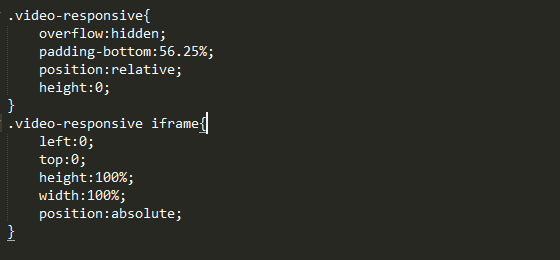
This CSS code will make the video responsive by setting the overflow property to hidden, which will hide any overflow content. It will also set the padding-bottom property to 56.25%, which is the height of the video player. The position property is set to relative for the div tag and absolute for the iframe tag. This will make the iframe tag fill the entire div tag.
Comments
Post a Comment